
Una
01

Una is a mobile application Focused on uniting teens and young adults towards a better future BY leveraging mixed media formats to engage and educate on important social issues on a global and local scale.

Objective
Empowering remote acitIvism
Scope
10 weeks
Project Type
Group
My Roles
Research, Analysis, Wireframing, Prototyping, USER Testing, BRANDING, Visual Design
Members
Alexander morris, Ericka Mardis, Han Peiyue, Yujia Zheng, Xiyue Chen
Tools Used
Figma, Google Form, Notion, Photoshop, Principle, RotatO


Lorem ipsum dolor sit amet, consectetur adipiscing elit. Suspendisse consequat lacinia sem, quis placerat arcu interdum eget.
introducing UNA.
A warm welcome
Una aims to educate as to promote long term change, considering this the onboarding process balances efficient onboarding with understanding of purpose by providing a brief overview of the different aspects of the platform through concise copy and accompanying illustrations.
Colour theory was leveraged to enforce the different aspects of the platform by animating though brand colours but also to introduce the brand itself.
Design for the go
When opening the Una application, users can expect to see their spotlight, this is a focus on current and pressing issues.
Below this they can easily track and reflect on the progress of their previous browsing activity, in hopes to encourage complete education of movements rather than one of readings.
Below this they can easily track and reflect on the progress of their previous browsing activity, in hopes to encourage complete education of movements rather than one of readings.
The next section is suggested events, this aims to drive both online and in person engagement and transition efforts beyond just the Una application. These events can be suggest based on locality but also user activity to ensure relevance.
Finally the preceding sections are contextual to current events and user's consumption habits, akin to the Spotify homepage sections.
Finally the preceding sections are contextual to current events and user's consumption habits, akin to the Spotify homepage sections.
Digestible, variable medium content delivery
Based on findings from user interviews paired with empathy mapping, it became clear that content preference types is largely variable as there is geographical variance let alone on an individual level, designing with this in mind Una presents users with digestible content of a wide variety of content types ranging from video through to statistics.
In increasing effeciency and effectiveness in user education, machine learning is used to monitor the content parsing rates of users against geographical averages over time and adjusts their content feed to accommodate content types they best resonate with.
In increasing effeciency and effectiveness in user education, machine learning is used to monitor the content parsing rates of users against geographical averages over time and adjusts their content feed to accommodate content types they best resonate with.
Moreover movements display a fixed progress bar along with time estimates to communicate to the user how much of their focus will be required, using this information users can determine if their current context is appropriate to start/continue their education or if they should wait until a more appropriate time.
Finally, specific considerations were made for the mobile platform such as having an expanding video player that is minimised by default to the right of the display following fitt's law to increase usability by making it more actionable when scrolling.
Finally, specific considerations were made for the mobile platform such as having an expanding video player that is minimised by default to the right of the display following fitt's law to increase usability by making it more actionable when scrolling.
Promoting relevant, constructive discussion
As a means of promoting constructive discussion typical comment solutions were forgone in favour of prompts, these are user generated questions and reflections related to a specific piece of content that other users can browse and discuss.
This approach attempts to keep conversations closer to the information in hopes of minimising the deterioration of discourse commonly seen on the internet.
The freedom to choose
A common issue with platforms where education and conversation occur is distrust at the hands of corporate moderation. It's a wicked problem in that platforms have a responsibility for ensuring the safety of users but in doing so, inherently causes distrust by bluring the lines of inclusivity and censorship.
Attempting to solve this issue, Una affords users the ability to decide what level of community moderation they would like to experience in hopes of striking a balance between individual responsibility and community moderation by being as transparent as possible.
UNA AIMS TO EMPOWER 18 TO 24 YEAR OLDS TO ENGAGE WITH activism and social education in a Remote society
How it started
We believe that change starts with just one person.
Due to the impacts of COVID-19, socieities are more isolated and divided than they have been in recent years.
Exposure to many important movements, causes and organizations has fallen due to social distance and quatantine measures.
Exposure to many important movements, causes and organizations has fallen due to social distance and quatantine measures.
There are increased health and safety risks due to COVID-19 and protest around the world where larger gatherings occur.
Growing divisiveness in the media and in public discourse can contort and detract from the true meaning and message of activism for social justice.
Growing divisiveness in the media and in public discourse can contort and detract from the true meaning and message of activism for social justice.
The goal
Understand how people consume the news, access, engage with and share social movements and what movements matter to them the most as to provide a platform for interactive, accessible education.
The process
01
Discover
02
Define
03
Develop
04
Deliver
Apart ≠ Divided
Discover
At this stage, primary research was conducted in order to gain deeper insights into the accessibility of news, its consumption, and associations based on contextual inquiries developed from user interviews, quastionnaires, day in the life exercises, shadowing and town watching studies.
Establishing a foundational understanding of the problem and users

Starting off the discover phase a user survey was created that served to provide a foundation from which the scope of the problem, user insights and other guiding insights can be derived.
The survey was distributed across the world in order to develop a global understanding and encapsulate cultural/geographical variances surrounding the issue.
survey composition

86
Responses oustide of china
465
Responses within China
When creating the survey it was important sufficiently cover all aspects of the activism process rather than just relying on intuition and focusing on one specific area that could lead to an ineffective solution or poor product/market fit.
A consideration was made for the international context in which user's might be answering the survey from and thus some questsions were modified or omitted from the survey that was distributed throught China as to take into account the cultural and political climate.
survey results

The data collect from the survey proved effective in highlighting key insights regarding the target user, news/information consumption, activism engagement and outlooks on social climates.
This data would go on to help inform design decisions and guide further methodologies such as user personas and user journey maps when processed in the Define stage.
affording accessible education

Using the survey metadata the content/information preference types could be observed as means of affording accessible education on a global scale. This can be seen through the variance in preferences from recipients from Denmark resonating most with statistics in contrast to Video in Uruguay.
This highlighted an important consideration in that the solution should account for these differing preferences so to facilitate optimal education for all users.
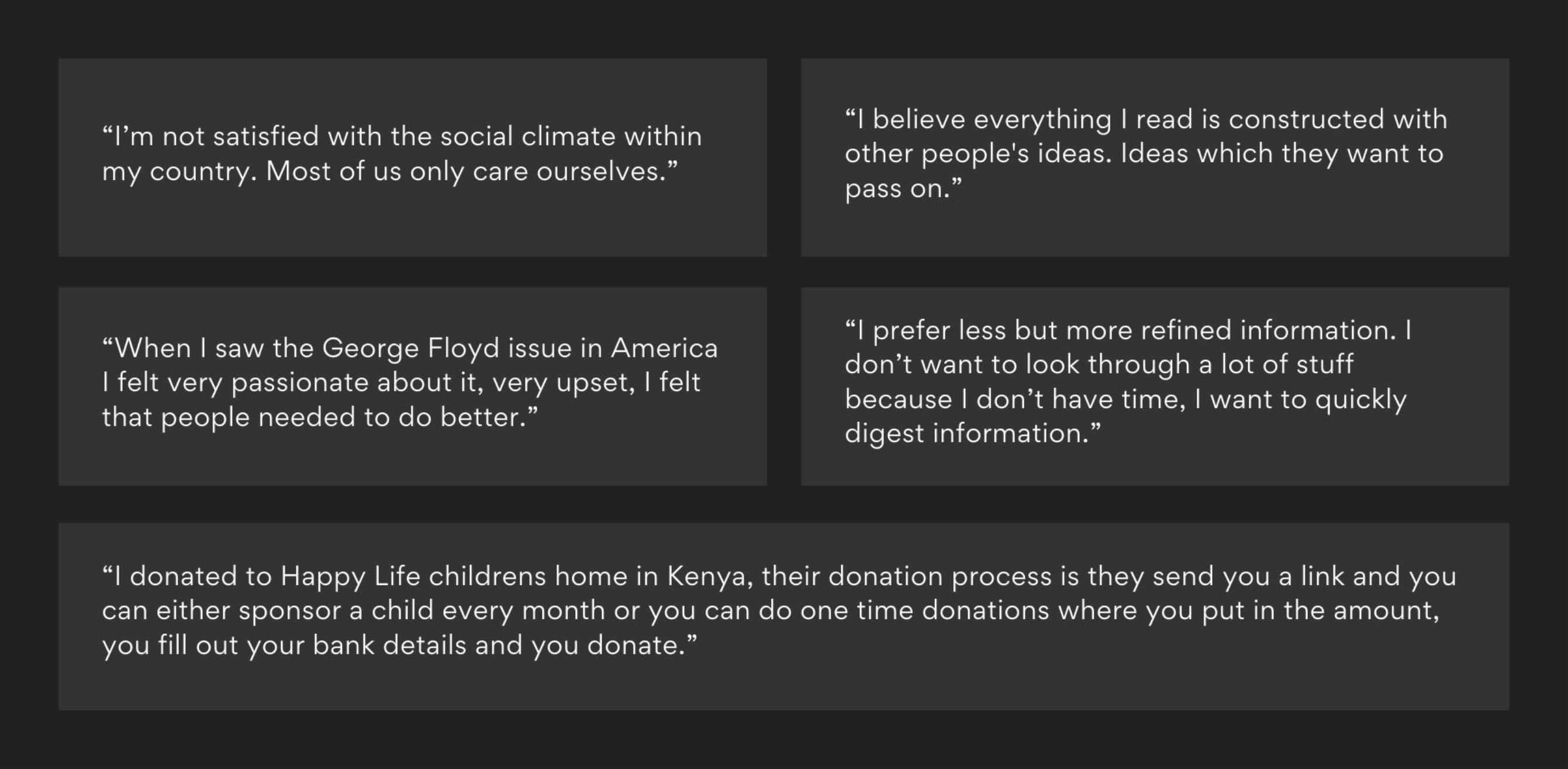
USER INTERVIEWS
Preceding the user survey, qualitative data was collected via user interviews conducted across users and organizations
Insights from these interviews highlighted more nuanced motivations for why users engage with activism, how activism aligns with their daily lives, opinions on current donation processes.

Competitive Analysis
As to discover the stregnths, weakenesses and opporunity areas of the current market offerings competitive analysis was carried out.
Current market offerings place an emphasis on instant gratification through small monetary contributions instead of long term solutions that combine financial contributions with a focus on education, connection, accessibility, rewards and real social, economic and environmental change.
A recurring shortcoming of these solutions is that they require the user's active focus and require space to be made into their daily routine instead of functioning with and integrating into their daily routines.
These platforms lack
Simplicity
Engagement
Clarity
Empathy
Interaction
Flexibility
Accessibility

TOWN WATCHING
Town watching allowed for the observation and understanding of the spirit and lives of users at the living environment where activism takes place, on the ground.
In July of 2020, Town watching was conducted across New York City at the BLM protests against policy brutality and racial inequality after the murder of George Floyd.
A key observation was that not all participants were wearing masks as there were no enforcable requirements. The roads were completely occupied by the movemenet and police presence
Office and Retail windows were sealed up with wooden boards to prevent any damage or looting..
A key observation was that not all participants were wearing masks as there were no enforcable requirements. The roads were completely occupied by the movemenet and police presence
Office and Retail windows were sealed up with wooden boards to prevent any damage or looting..
The atmosphere on the street was one of desperation, frustration and distain for recent events.
Notably, the squares were crowded full of participants with no social distancing, highlighting the urgency of the movement that the threat posed to the protesters' safety outweighed that of them protesting during a pandemic.
Notably, the squares were crowded full of participants with no social distancing, highlighting the urgency of the movement that the threat posed to the protesters' safety outweighed that of them protesting during a pandemic.

Day in the life
a Day in the life study was held As a means of discovering how the solution could best integrate into the users' everyday lives in the least disruptive manner and promote a long term solution.
>10 Hours
Per day Spent on smart devices
>6 hours
Per day spent on Smatrt Phone
The observation found that smart devices accounted for more than 10 hours of activity per day and that over half that time invovled the use of a smartphone.
When observing the user's routine, there are opportunity areas where the solution could integrate itself into the user's routine, such as in the morning when they consume their breakfast or play games late at night.
When observing the user's routine, there are opportunity areas where the solution could integrate itself into the user's routine, such as in the morning when they consume their breakfast or play games late at night.
It is important that any such integration should not be disruptive and not detract from their daily life through any added burden. Instead it should look to consciously replace activities as seen fit by the user through its own merits and experience.
SHADOWING

Shadowing provided the opportunity to develop a great understanding of how in which organizations and volunteers engage with initiatives and the contexts in which they do so.
A notable observation being that there was a particular struggle in recruiting young participants to partake in the initiatives and that for volunteers it is convoluted and time consuming to find suitable activities across numerous platforms.

5 Whys
The 5 Whys methodology was then used to explore cause and effect relationships among engagement and interaction with social activism to determine the root cause of our identified problem and expose weaknesses in the current systems and processes.
The 5 Whys methodology was then used to explore cause and effect relationships among engagement and interaction with social activism to determine the root cause of our identified problem and expose weaknesses in the current systems and processes.
Understanding, Caring and Engaging are more impactful motivators to create change than short terms solutions such as fleeting one off donations. Eduating one generation could change the lifetimes of many.
Why do people not engage with activism?
Why do people not Why do people not engage with organizations?
Why do users donate?
Why don't users donate?
Why don't users share social problems with others?
HOw Might WE Questions
How might we leverage mobile platforms to promote change and unify a divided society?
How might we encourage users to learn about news in more intuitive and exciting ways?
How might we increase accesibility and trust between users and organizations by incentivising engagement?
Define
Throughout the define phase the raw data points from user interviews and surveys were processed by various methodologies to develop deep insights about user needs, pain points, current market solutions, social climates and THE most pressing social issues and movements with the goal of better representing the problem, the users and potential solutions.
Affinity Diagraming
288
Valuable Data Points
61
Groups
8
Themes
3
Areas

Affinity diagraming was used to parse insights from the raw data collected from the discover phase. Key findings were the lack of time and accessibility acting as barriers to engagement and lack of discoverability.
These insights were then used to inform further methodologies such as user personas, empathy mapping and user journey mapping in the process of providing further clarity and focus to the solution.
Synthesized insights
Within our target audience, a mobile platfOrm would be better suited than a website
It is essential to ensure the accuarcy of information
Build connections between organizations and users by making the impacts and motivations of organizations clear
Be mindful of the user's time, simplify content delivery by providing option for additional content
Sharing is an important component of activism, especially though the internet domain
Users have an interest in both local and global issues, but struggle to discover either
Users exhibit overwhelmingly strong emotions surrounding activism, yet less than half engage with it due to time constraints, lack of motivation and fear
Conveying predominantly positive associated emotions when users make financial contributions can incentivize invovlement
After completing the affinitization process, numerous insights were derived pertaining to Social issues, the market/products and user engagement.
USER PERSONAS

In order to better represent and empathise with the target users, user personas were created from the data collected in the discovery phase and affinitized insights.
These personas aid with informing potential solutions through an improved understanding of the user's contexts, backgrounds, needs, motivations and pinpoints.
Empathy Mapping

Empathy mapping was used to articulate and visualize the newfound knowledge and understanding of user behaviours, attitudes, problems and opportunities.
This understanding helped to to holistically identify the best approach to creating a solution that users resonate with.
Common themes from emapthy mapping
Concerned about contracting covid-19 when engaging with activism
feeling Overwhelmed with misinformation
View activism as a method of expressing what they believe in
Motivated by creating a better future but unsure of how/where to start
Express their beliefs through their self image
USER SCENARIOS

Framing the themes from empathy mapping in a more user centred manner, user scenarios were created to visualise how and where these themes exist in there user's domain.
It was important to frame these insights across several scenarios as to reflect the varying user contexts that exist due to global scale of the issue.
USER JOURNEY MAPPING

Taking the themes highlighted in the empathy mapping and visualised in the user scenarios, a user journey map was created to represent the experience of users across potential solution touchpoint and highlight pain points arcross the journey.
These pain points present insightful opportunities to improve the experience at the touch point that will serve to create an improved user experience.
Understanding, Caring and Engaging are more impactful motivators to create change than short terms solutions such as fleeting one off donations. Eduating one generation could change the lifetimes of many.
DEVELOP
The next step was to diverge our solutions to further refine the Information Architecture and Wireframes through an iterative design appraoch to devise optimal solutions to the functions and features that had been derived. Proceeding this, a medium-fidelity prototype was used in user testing to validate the proposed design solutions.
INFORMATION ARCHITECTURE

The focus when creating the information architecture was designing a familiar (considering Jakob's law) but scaleable experience that accommodates the variety of differing content types that could be contained within a moment as well as flattens the depth of projects as to promote accessibility.
Moreover discovery was prioritised in the hierarchy through the "Happening now" section to provide focus on pressing movements around the globe.
ONBOARDING IDEATION

An iterative approach was taken when creating the solution wireframes to allow for sufficient solution exploration. An example of this being the onboarding interest selection screen. Several different designs were explored with the goal of producing the most effective solution.
Each solution had its strengths and weaknesses, for example, single column lists provided great emphasis on the individual movements but has poor discoverability by hiding numerous movements below the fold.
Each solution had its strengths and weaknesses, for example, single column lists provided great emphasis on the individual movements but has poor discoverability by hiding numerous movements below the fold.
Similarly honeycomb discovery despite being engaging has a clear visual hierarchy that could hinder the engagement of movements on the perifary of the screen.
Ultimately 2 column square icon lists was decided upon as it enforces visual consistency with other movement assets within the application flow, in turn enforcing recognition. These heuristic considerations coupled with showcasing a sufficient amount of movements prior to scroll made it the optimal solution that was explored.
Ultimately 2 column square icon lists was decided upon as it enforces visual consistency with other movement assets within the application flow, in turn enforcing recognition. These heuristic considerations coupled with showcasing a sufficient amount of movements prior to scroll made it the optimal solution that was explored.
Wireframing

When creating the solution wireframes it was important to consider the goals of the solutions and the user needs, in doing so, several key design decisions were made.
The first being omitting a skip CTA in the onboarding process, this being as understanding the educational nature of the application is key to promoting change and affording users the ability to skip this understanding could undermine the goal of the application.
Secondly, from insights gain from empathy mapping, user's have concerns about hostility surrounding discussions, to combat this the concept of prompts was introduced, these allow users to long press on content and submit a prompt about that specific piece of content as to keep conversations closer to the issue and be more productive.
Additionally, an emphasis was placed on gamification, this targeting the highlighted behaviour of user's wanting to represent the movements and beliefs they stand for.
This desire was accomodated in the profile tab by showcasing user progress towards specific merchandise rewards that can be achieved via engagement with events, education and donations to movements.
Accompanying this users can also view an user report that provides them with a motivational digest of their efforts broken down into minutes read, their popular movements and regions etc.
After completing the wireframing process, low fidelity prototypes were then created in Figma as to highlight the strengths and weaknesses of the proposed solutions.
LOW Fidelity Prototyping
Task 1: Onboarding
Task 2 FLOW 1: PROMPT CREATION
TASK 2 FLow 2: PROMPT CREATION
Task 3: Follow a movement & Register for an event
USER TESTING
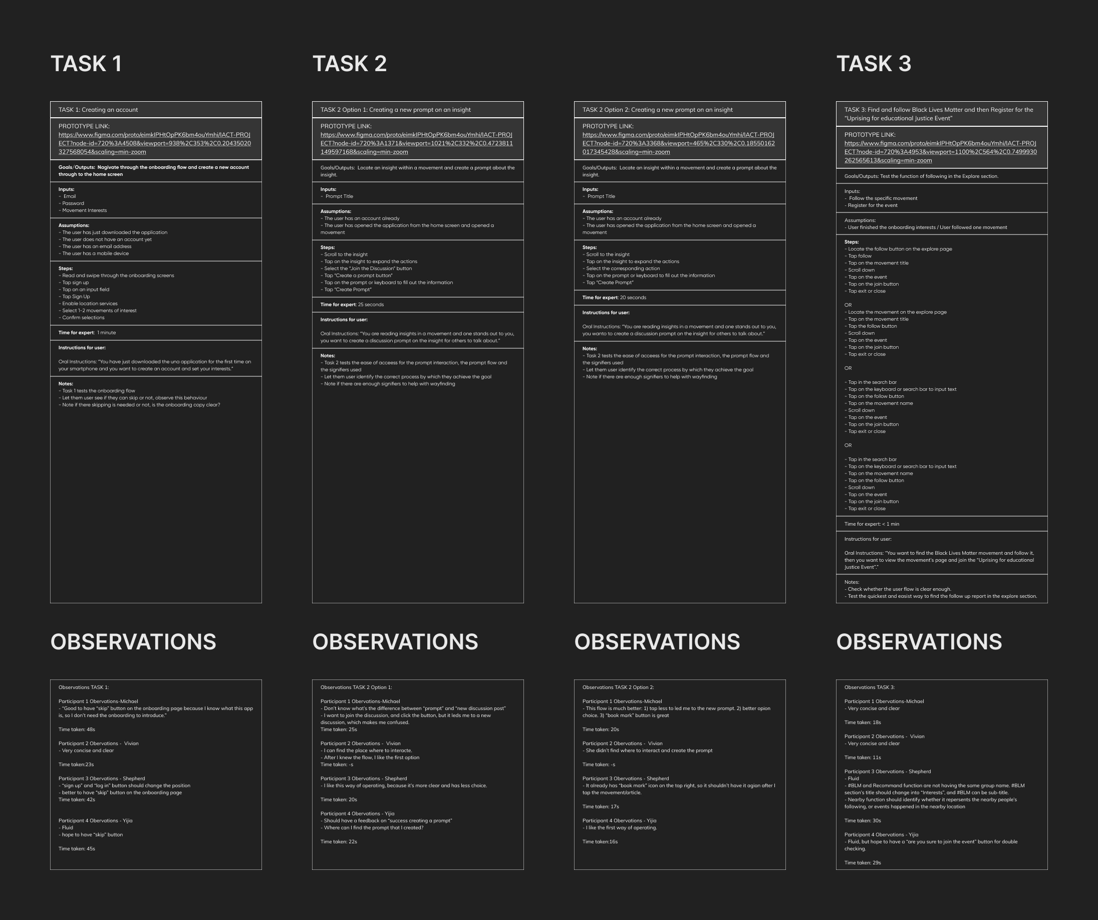
User testing was conducted across 3 specific tasks, with the objective of validating the onboarding experience, exploring the prompt creation flow and the accessibility of following a movement and enrolling for an event.
Testing was conducted according to strict instructions and aimed to highlight discrepancies between the conceptual model of the wireframes and the mental models' of the users.
Implemented DEsign Changes
Re-designed the movement and event breakdowns to be more digestable and consistent with the overal visual language
Decided against feedback on onboarding omitting a skip CTA as to not compromise the objective of promoting education & usability
fixed gaps in the onboardinG flow regarding user profile data collection and permissions
Decide to proceed with Prompt Flow 1 as navigation was percieved to be easier
modified the home and explore page content to be more relevant to its functions
Added CONFIRMATION popups when CREATING prompts to help signify action termination

Revised information architecture
Based on the feedback received from user testing and heuristic evaluation it was deemed necessary to conduct card sorting to determine a revised information architecture for the home and explore tabs.
On the Home tab, the focus was shifted towards highlighting specific movements via a spotlight and then promoting accessibility and ensuring the solution fits into the stop and start nature of the users' daily routines by featuring the"jump back in" section previously on the explore tab that showcases the recent movements the user has been engaging with.
On the Home tab, the focus was shifted towards highlighting specific movements via a spotlight and then promoting accessibility and ensuring the solution fits into the stop and start nature of the users' daily routines by featuring the"jump back in" section previously on the explore tab that showcases the recent movements the user has been engaging with.
Moving the "jump back in" section from the Explore tab promoted all assets in the visual hierarchy and facilitated the inclusion of a topic discussion section that aims to bridge the gap between passive education and active education through discussions.
Deliver
After refining the solution it was time to provide it a visual identity and brand that aligns with the project goals.
Una
(oo-nuh) nounone; the personification of truth, beauty, and unity.
identity through inclusivity
identity through inclusivity


The Una brand places a focus on accessibility and inclusivity, reflected by the logo mark and echoed by the meaning of Una. Supporting this is simple and identifiable stroke based illustrations that is utilised across assets.
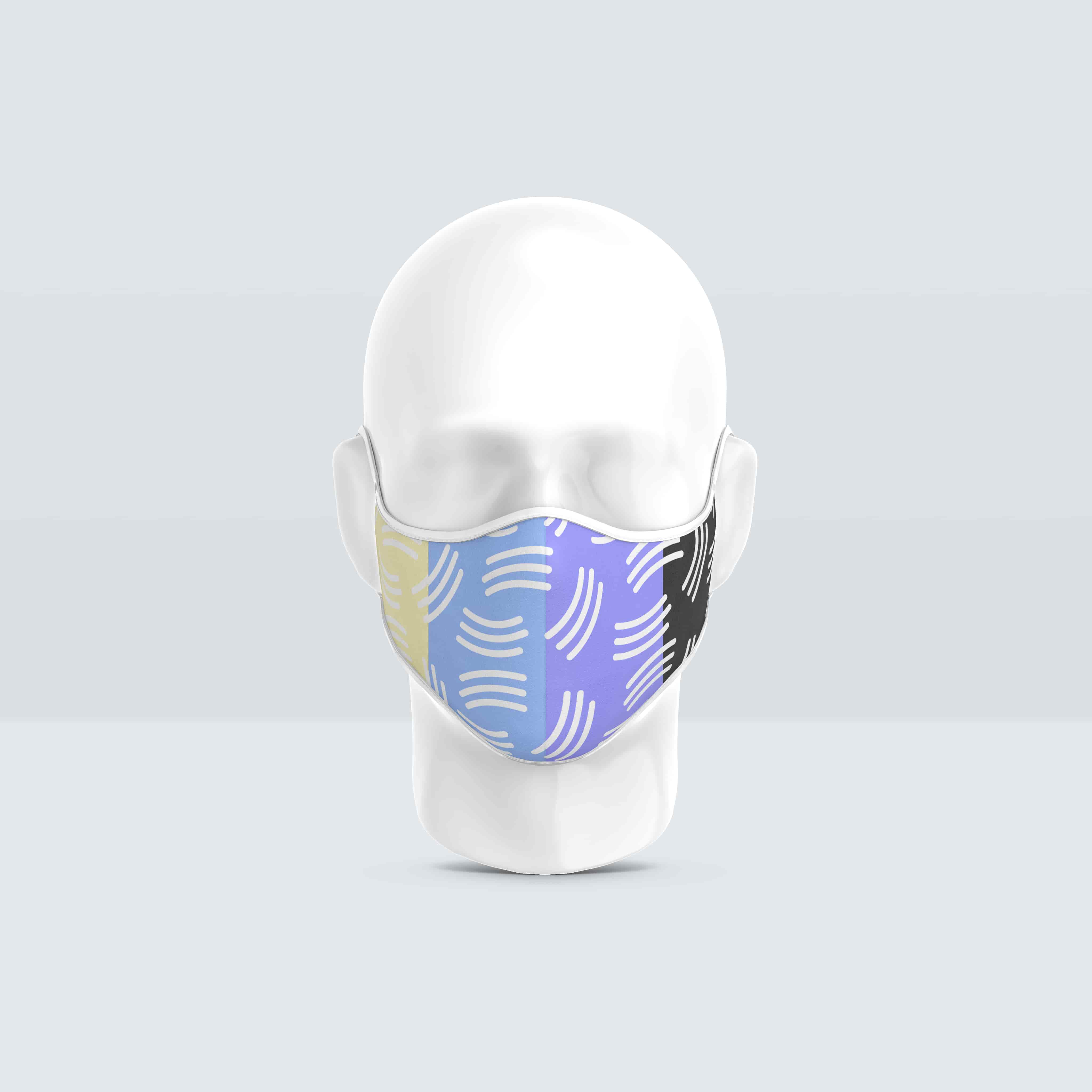
In driving gamification it was important to have reward items that incentivise users to engage with the platform but also double as tools that bridge the divide between the digital and real world.
In driving gamification it was important to have reward items that incentivise users to engage with the platform but also double as tools that bridge the divide between the digital and real world.
This is key in improving discoverability and onboarding new users from in-person activism onto the platform and vice versa.

Ensuring accessibility
When creating the high fidelity visualisations it was a priority to ensure accessibility in every regard.
The Stark Figma plugin was used to check colour contrast against accessible standards and text readability across several different types of colour blindness.
HIGH FIDELITY VISUALISATIONS

Outisde of implementing the design changes from user testing feedback, the process of creating the high fidelity visualisations involved translating brand guidelines and creating a design system for typography and assets to ensure visual, hierarchal and navigational consistency.
It was decided to use a dark mode by default as to reduce eye strain on users however light mode is toggle able in the application settings. This decisions helps to further shift user focus on to the content assets within movements.
Takeaways
Through una, we were able to empower users to discover and educate themselves on both local and global movements to unify world issues.
By connecting users with movements and organizations in convenient, digestible, engaging ways, we strived to guide young adults towards creating change for a better future.
By connecting users with movements and organizations in convenient, digestible, engaging ways, we strived to guide young adults towards creating change for a better future.
Further user testing would have allowed for a more refined user flow. If the project scope was larger, it would be valuable to conduct deep A/B testing ot make more informed design decisions that align with the project objectives.